If you aren’t reaching your monthly lead goal, you might be wondering if there is something wrong with your landing page. Is the call to action working? Are the colors stirring enough emotion?
If your landing pages aren’t producing conversions like they should, it may be time for a makeover. No one wants to miss out on the chance to convert as many leads as possible.
Consider these six quick fixes that will have your landing pages producing leads in no time at all!
1. Shorten Your Lead Form
Don’t ask for information that you don’t feel is absolutely essential and your user doesn’t feel secure giving you. There are few things worse than being asked what industry you work in when it isn’t relevant to the information you’re receiving. The simpler your lead form is, the more likely a customer is to fill it out. For starters, simply ask for name, email, company name and phone number. This information is often commonly asked across the web and shouldn’t take your visitor off guard.

2. Include Few Outgoing Links
Keep the visitor on the right path to becoming a lead. The last thing you want to do on your landing page is take the user away from converting. By placing outbound links on your page you are doing just that. To ensure your visitor converts into a lead, make sure that the only way off the page is to fill out the lead form.
3. Only Include One Call To Action
By only providing one CTA per landing page, you ensuring that you landing page only has one end objective. Keeping the goal clear not only helps you keep your leads organized but your visitors will know exactly what they are receiving in return for their coveted information.
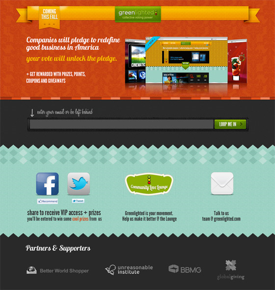
4. Add Social Sharing Buttons
Adding social sharing buttons to your landing page can make all the difference in the world. Your visitor’s social followers may be interested in the same offer and could potentially come flocking to your landing page at the click of a button. Greenlighter does a great job in the example (see below).
5. Use color and contrast to make your call to action pop off the page
This one is a bit of a no brainer. Your call to action should pop off the page. Use colors that stand out against the background and prompt positive emotion in the user.
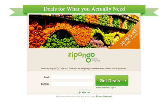
For example: Green is very refreshing and relaxing, leaving people feeling inspired.
6. Send your new leads to a thank you page and set up an auto response email
This is your chance to engage with your new customers. Make sure that they know that you’re glad they’re there! A short email or a simple thank you page will go a long way in ensuring that you and your contact have a copious relationship moving forward.
